
2021Roger Tory Peterson Institute
Brand Identity | exhibition designThe goal:To help a one-of-a-kind nature institution modernize its brand and build a lasting legacy.
RTPI is a nature art museum in Jamestown, NY dedicated to the life and art of Roger Tory Peterson— the father of the modern field guide. Home to the largest collection of Peterson’s work, RTPI is a leader for the study, exhibition, and nurturing of art that matters to the planet. The institute was looking to re-infuse Peterson’s character back into the brand, while at the same time expanding their reach to help nurture the next generation of nature artists.


PUlling inspiration from natureTogether with Tanager Creative, we defined key personality traits for the RTPI brand that would reflect the organization’s mission and goals and align with its legacy. We developed a visual direction inspired by the “the wonder and complexity of nature,” establishing early on in the process that we would incorporate Peterson’s intricate bird illustrations as a key design element that would weave the founder’s legacy into the brand. For additional inspiration, we looked to Peterson’s early texts and sketches as well as to the architecture and ambiance of the RTPI building itself.
Logo BeforeLogo After
REIMAGINING A LEGACYRTPI’s original logo incorporated one of Peterson’s most famous works of art, but its complexity and lack of versatility was hindering efforts to update the brand’s digital presence and build its reputation as an institution of both regional and national significance. Using our established visual direction as a guide, we reimagined the snowy owl for the modern age, pairing it with a unique, organic custom wordmark that champions the name of the founder while still being able to adapt to a variety of applications.
In 2022, the RTPI owl icon was awarded recognition in the 13th book of LogoLounge.


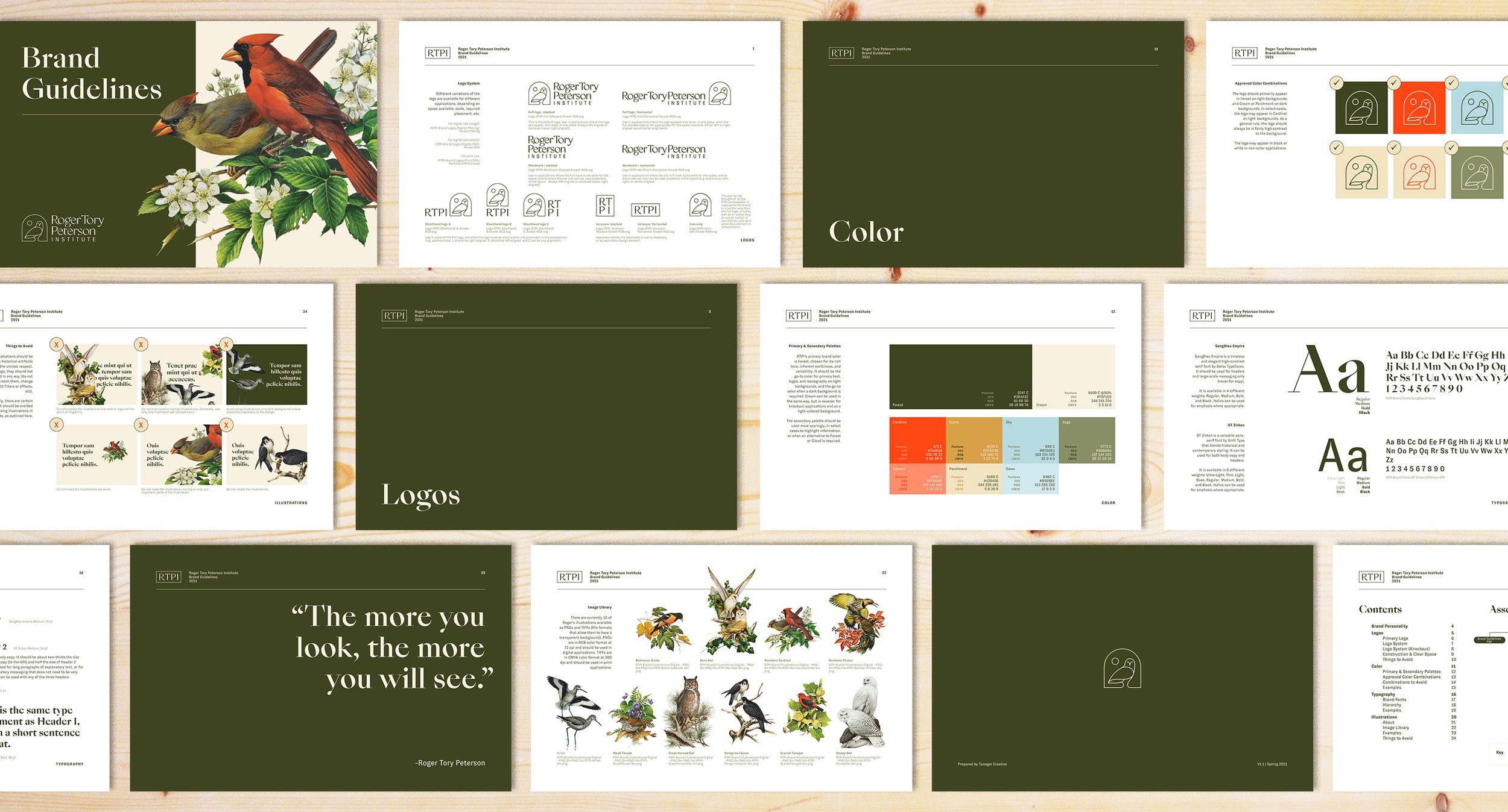
Bringing the brand to lifeWe built out the RTPI brand to incorporate a nature-inspired palette influenced by the colors of the Western NY region, owning a rich green as the primary tone to serve as a lush, unconventional background for the museum’s content, without competing with other imagery and artwork. An elegant, timeless serif by Swiss Typefaces paired with a utilitarian sans by Grilli Type bring a combination of historical and contemporary styling to the identity, allowing the brand to flex between practical and intriguing, depending on the application. To tie it all together, 10 of Peterson’s original works were carefully digitized and cut out to serve as supporting elements to use throughout the identity. Finally, all of these elements were compiled into a 26-page style guide that would instruct the RTPI team on how to put the brand into practice.
RTPI website design and build by Tanager Creative.


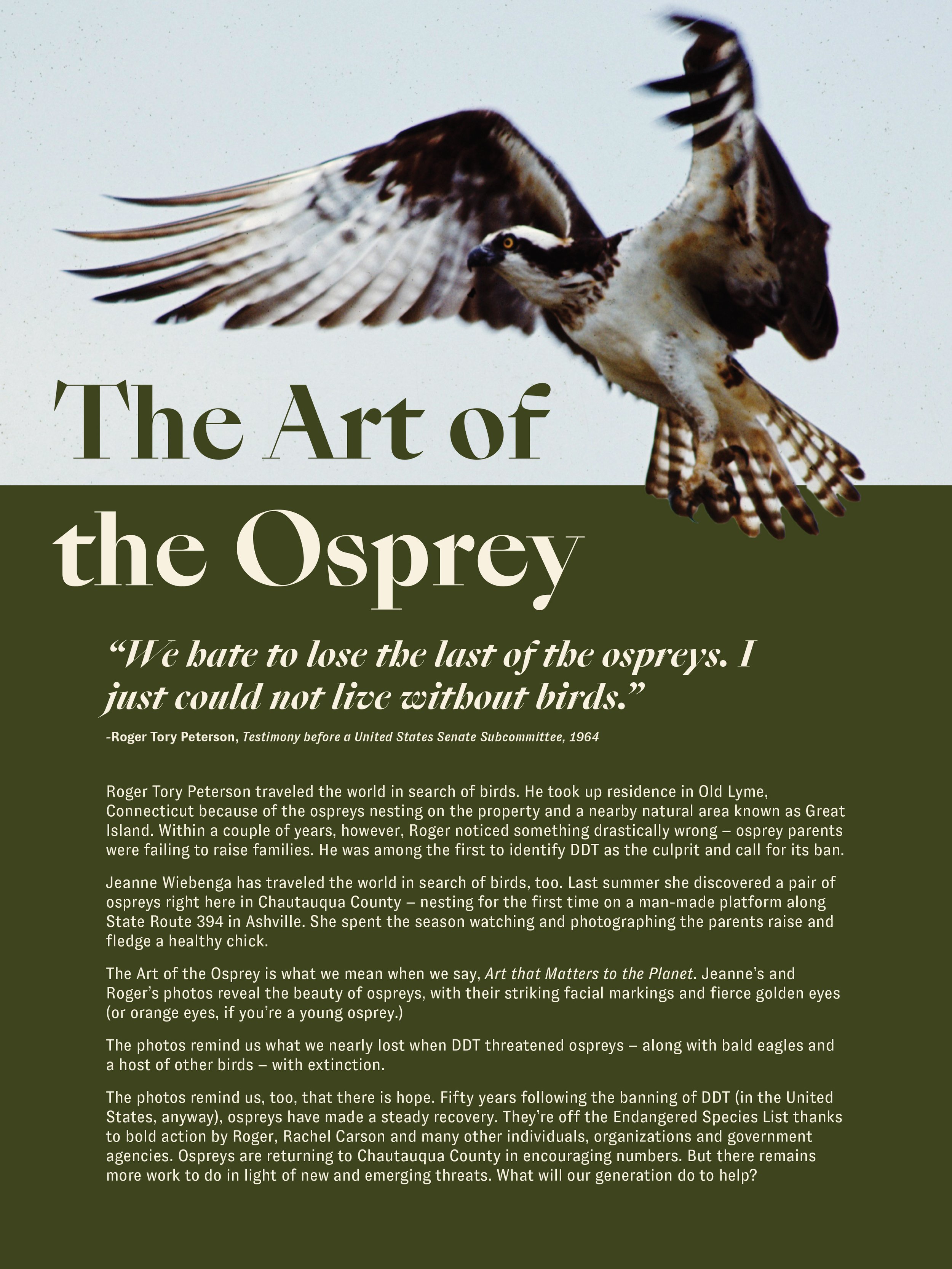
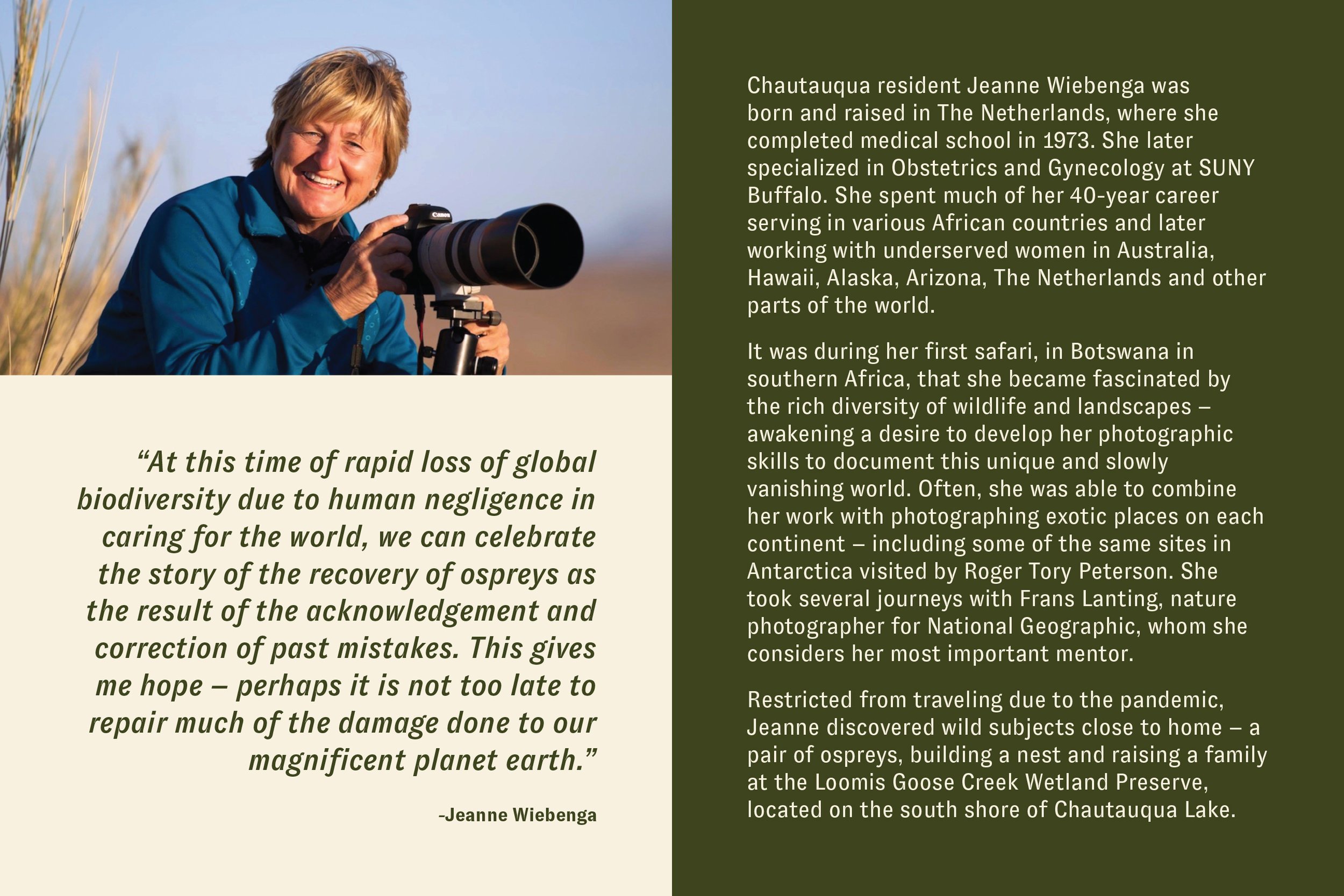
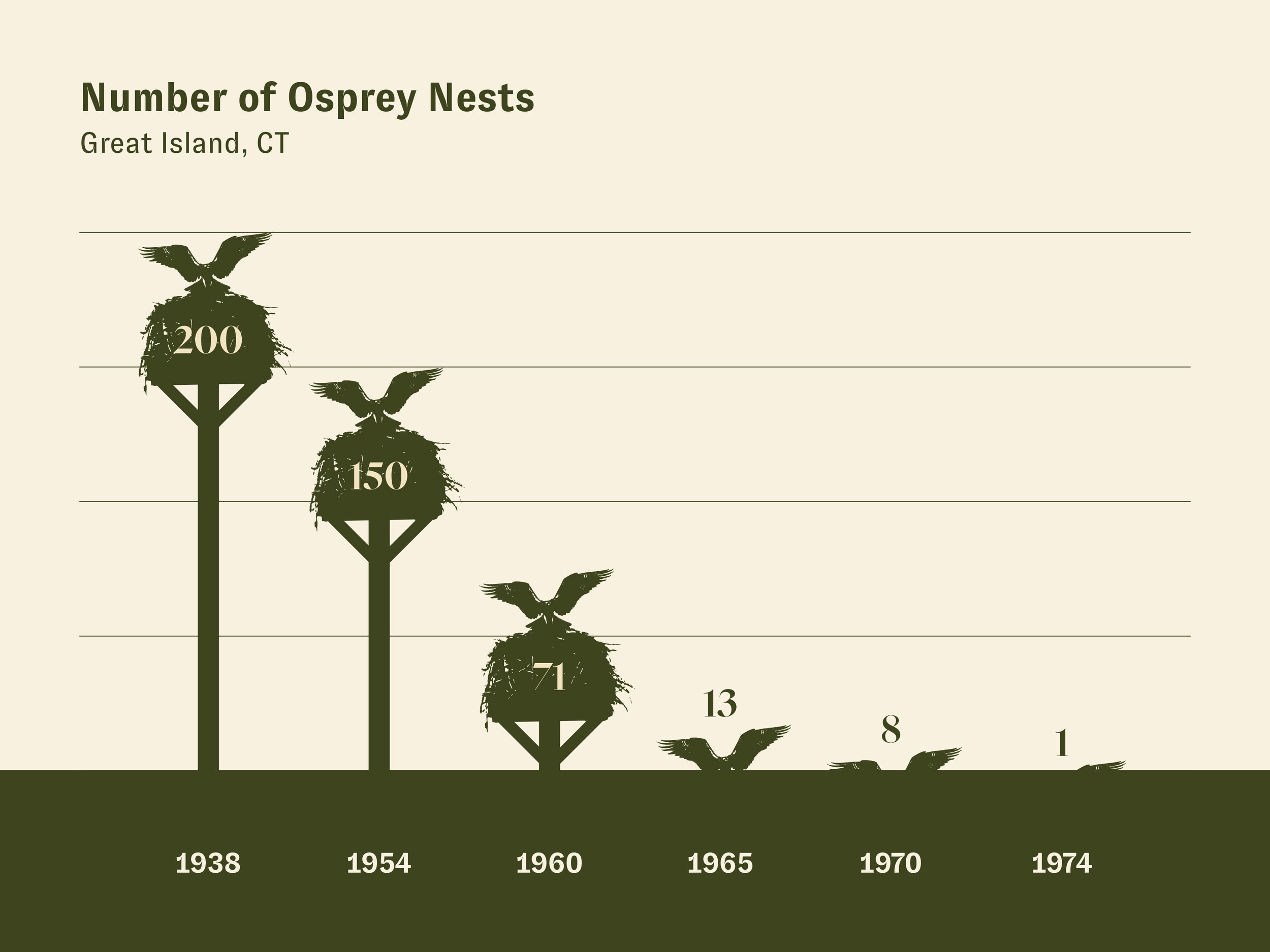

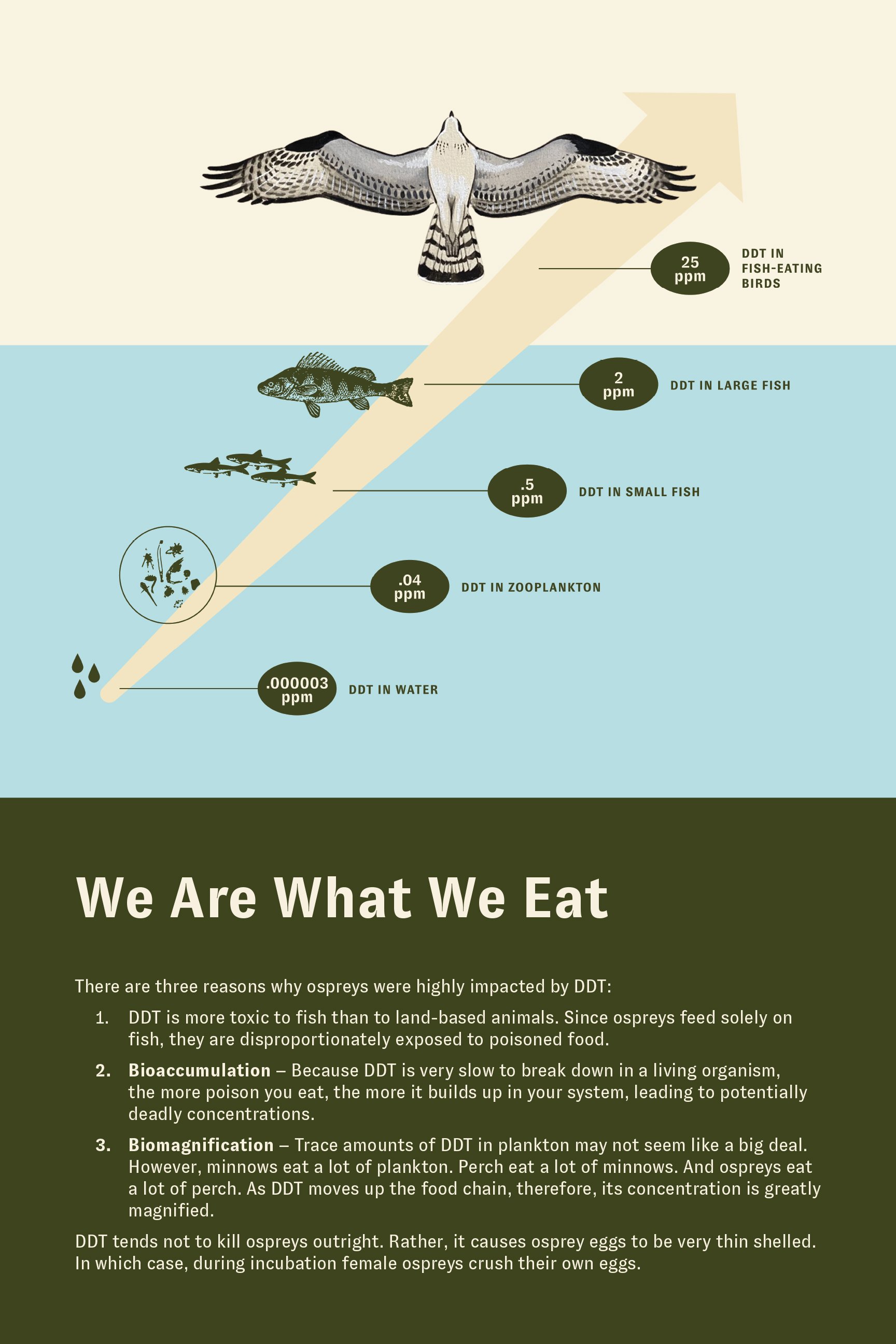
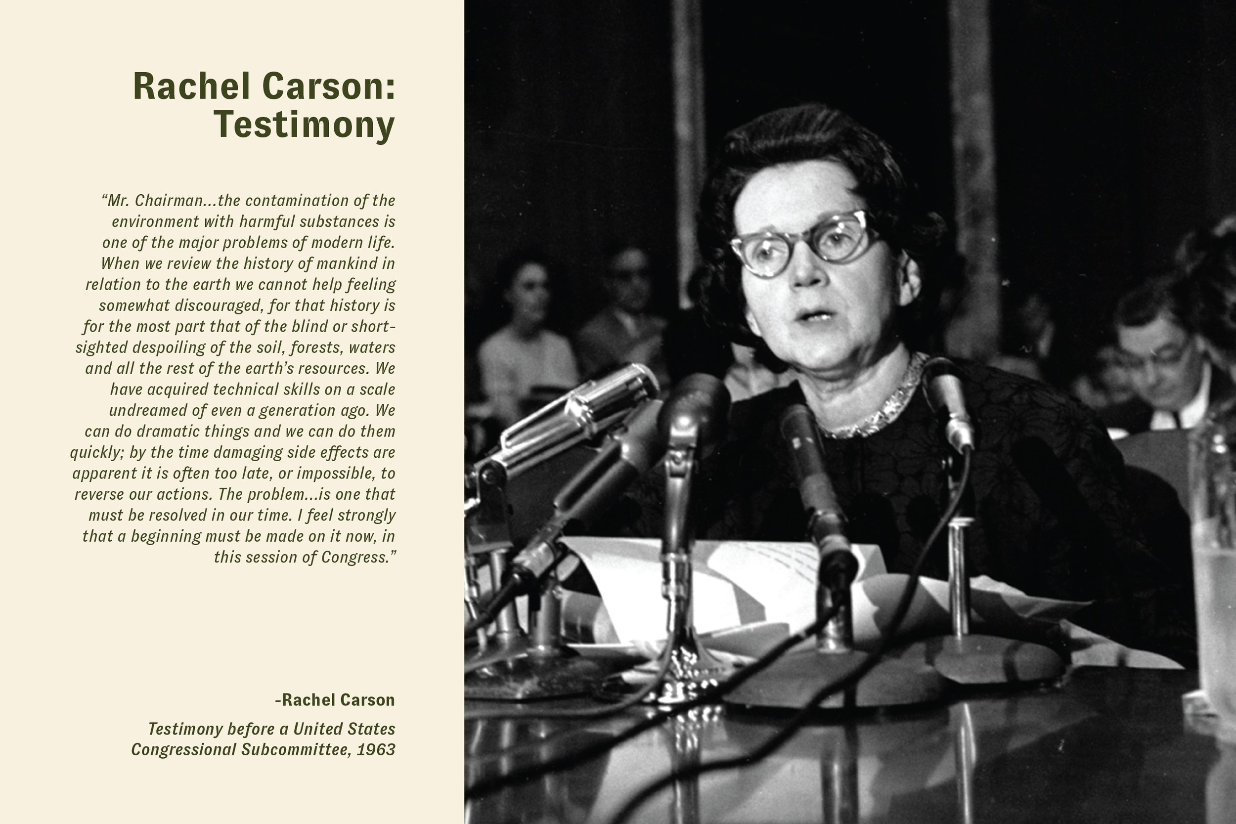
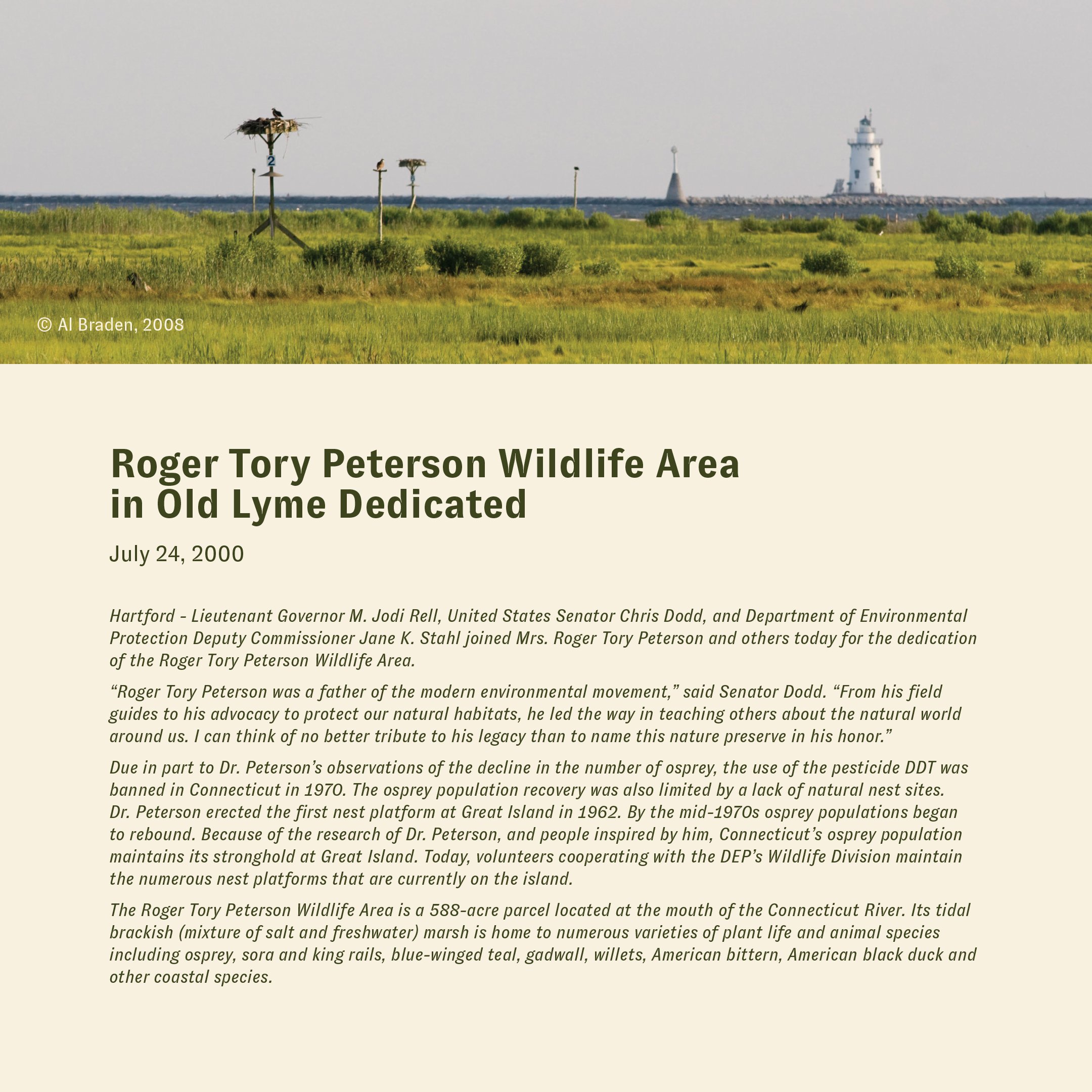
Exhibition DesignRTPI’s first exhibition after the rebrand — Art of the Osprey — tells the story of the decline and subsequent revitalization of osprey populations through the photos and artwork of Roger Tory Peterson and Jeanne Wiebenga. Using content provided by the RTPI team and in collaboration with Tanager, we built out over 60 assets to be included in the exhibition.